Homepage
Re-envisioning Boxed’s homepage, and redesigning the above fold experience.
The Problem
Boxed’s homepage was going on 3 years old without any major updates in UI/UX. As a hyper-visible part of the product, and with new aggressive business goals, we needed a way to better communicate to our new visitors and users yet to order.
The Plan
We decided to incrementally make changes to the new user homepage and continually test as we go. The first version was created without any development, using our existing modules with updated creative. Our next step was to change the top banner, and eventually will update the entire experience.
Where we started
The last time we updated our homepage experience was in 2016. When we did so, we switched over to a header design very similar to what we have now on Boxed. Based on A/B testing, we found that it preformed better than the older version. From there our Product Design Manager, Jillian Crudo, lead an entire redesign that allowed marketing to better feature the on going campaigns and features like our referral program.
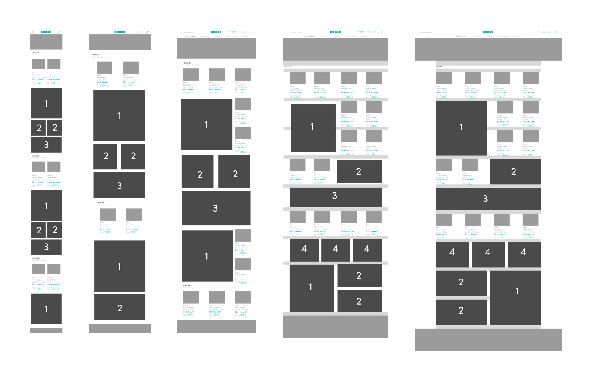
Wireframes depicting the updated modules For our current Homepage.
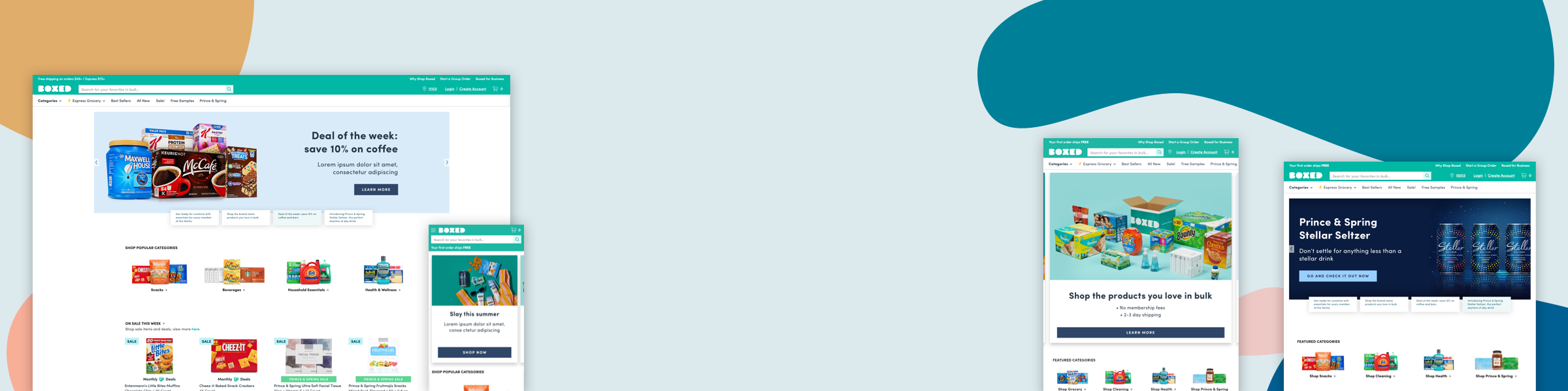
First iteration of the final UI designs.
Moving forward in 2019
When revisions to homepage were included in the roadmap, the product team decided to move incrementally to prove out the value of our design changes. For this reason and for the sake of resources, we decided to use our current homepage design, but rearrange the modules and update the creative to better appeal to new users.
Feature Requirements
Research, Discovery, and Sketching
During this stage, I read through Baymard’s e-commerce usability document on Homepage.
Sketches depicting WHAT SHOULD CHANGE ON THE CURRENT NEW USER HOMEPAGE
I also looked at over a dozen other companies to see what direct and indirect competitors are doing.
In the first version of the page, we decided to prove out our requirements by launching a version that required no development work, using our current modules.
Version two
For the second version, we went back to the drawing board and envisioned what we would want without restrictions.
The Product Managers decided we should focus on the top banner to fit it within the sprint. I did multiple versions of the banner and after collaborating with the marketing, and content teams, narrowed it down to a final version.
Further Research and Sketching
To narrow down the responsive versions and solidify the final design, I went back to research and sketching to inform my decisions.
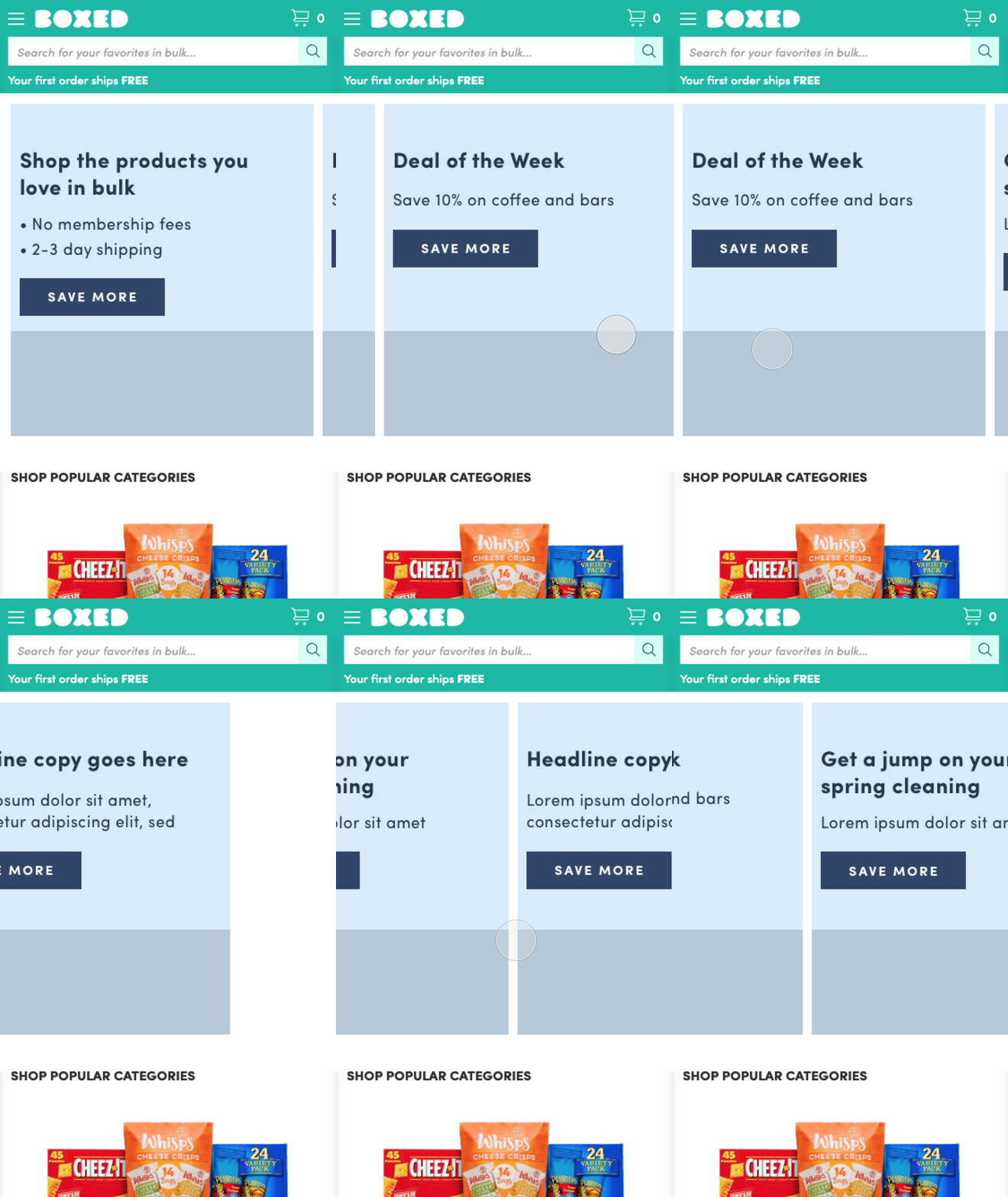
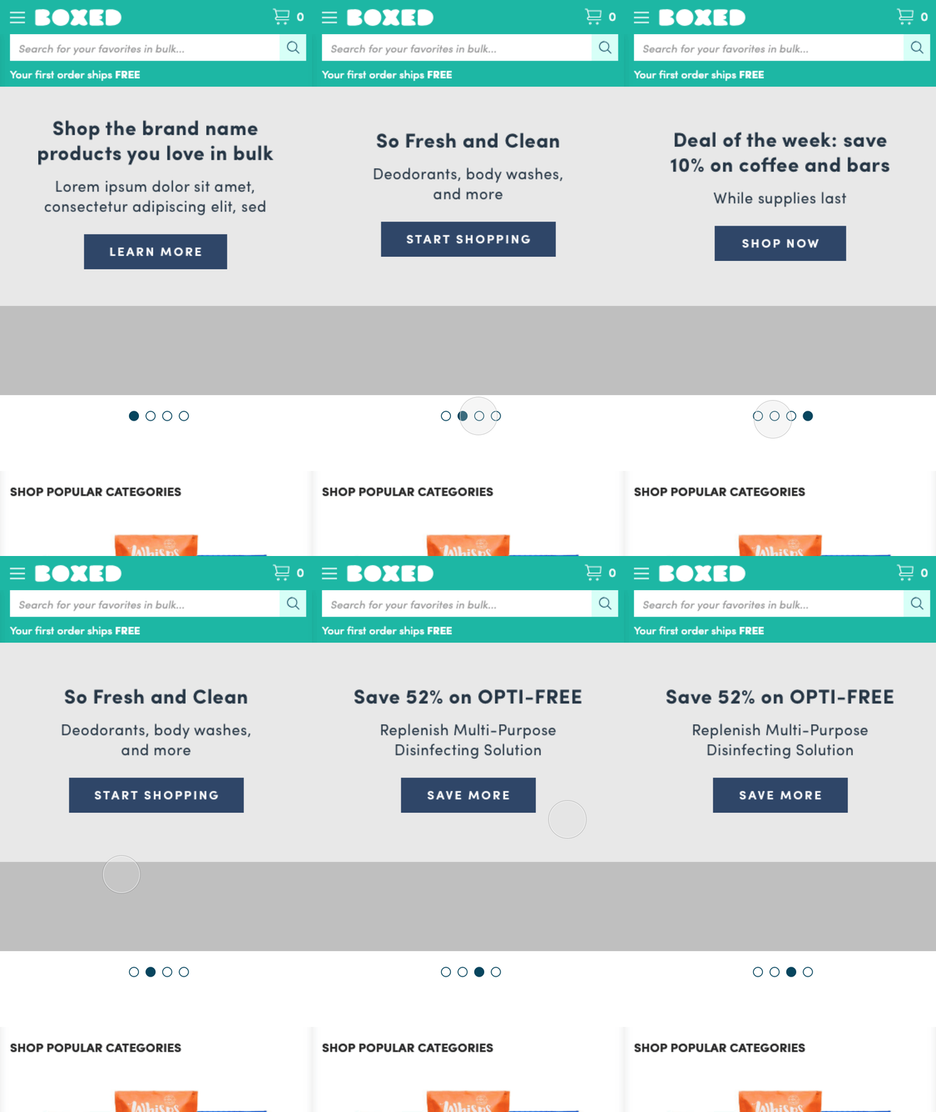
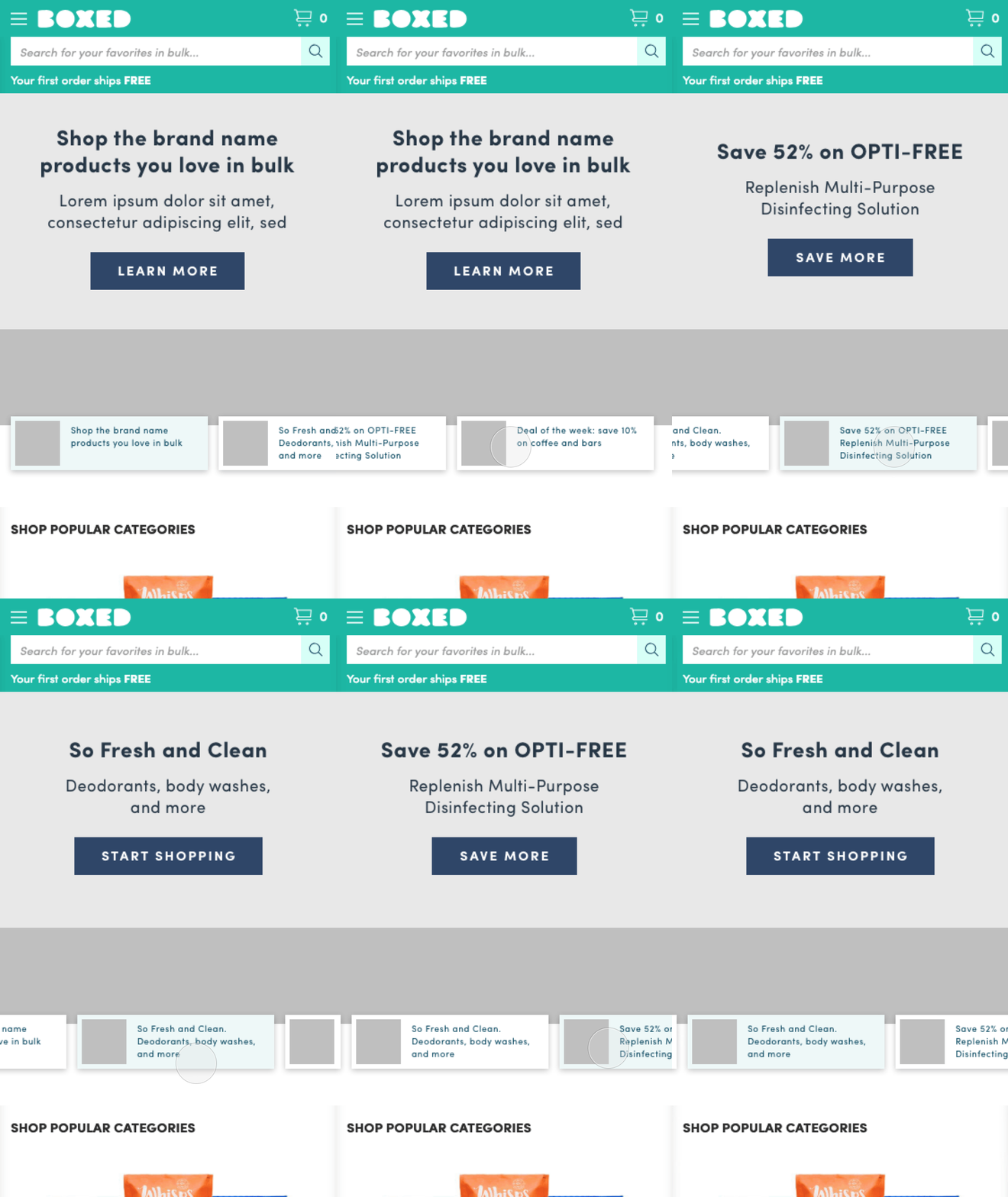
Four versions of how we could translate our desktop preview to mobile
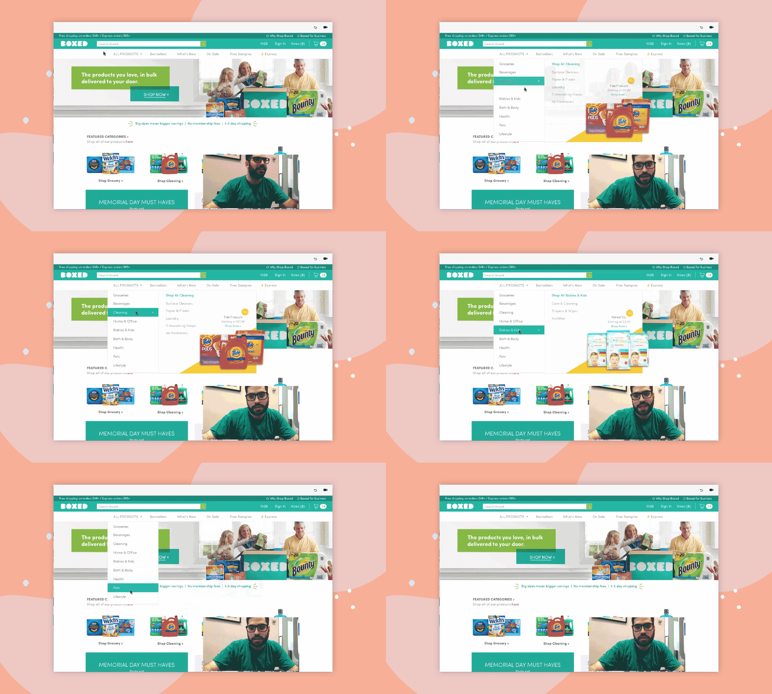
Prototyping the interaction
Revisiting our Assumptions
After meeting with the content team, we realized that we should revise the design to make it easier for the team to update content. We decided to simplify the responsive versions, moving the text below the image. We also tweaked the template to make it easier for the content team to re-purpose our photography across all screens.
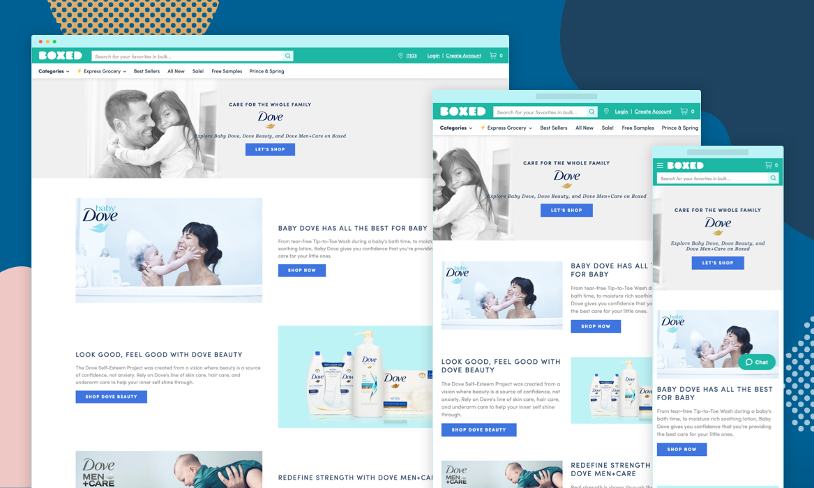
Final Responsive Banner - Centered Text - Desktop
Final Responsive Banner - Left Aligned Text - Desktop
Final Responsive Banner - Right Aligned Text - Desktop
Final Responsive Banner - Left Aligned Text - Desktop
Final Responsive Banner - iPad and iPhone
To make sure the handoff between product and marketing/merchandising was smooth, I came up with a photoshop template for the content designers to use when making banners. I also created prototypes using these designs to test the viability of the feature in front of users, as well as demonstrate the functionality to developers and marketing once our banner proved usable.
A video walk-through of the photoshop template for the content team.
Video prototype of the desktop functionality
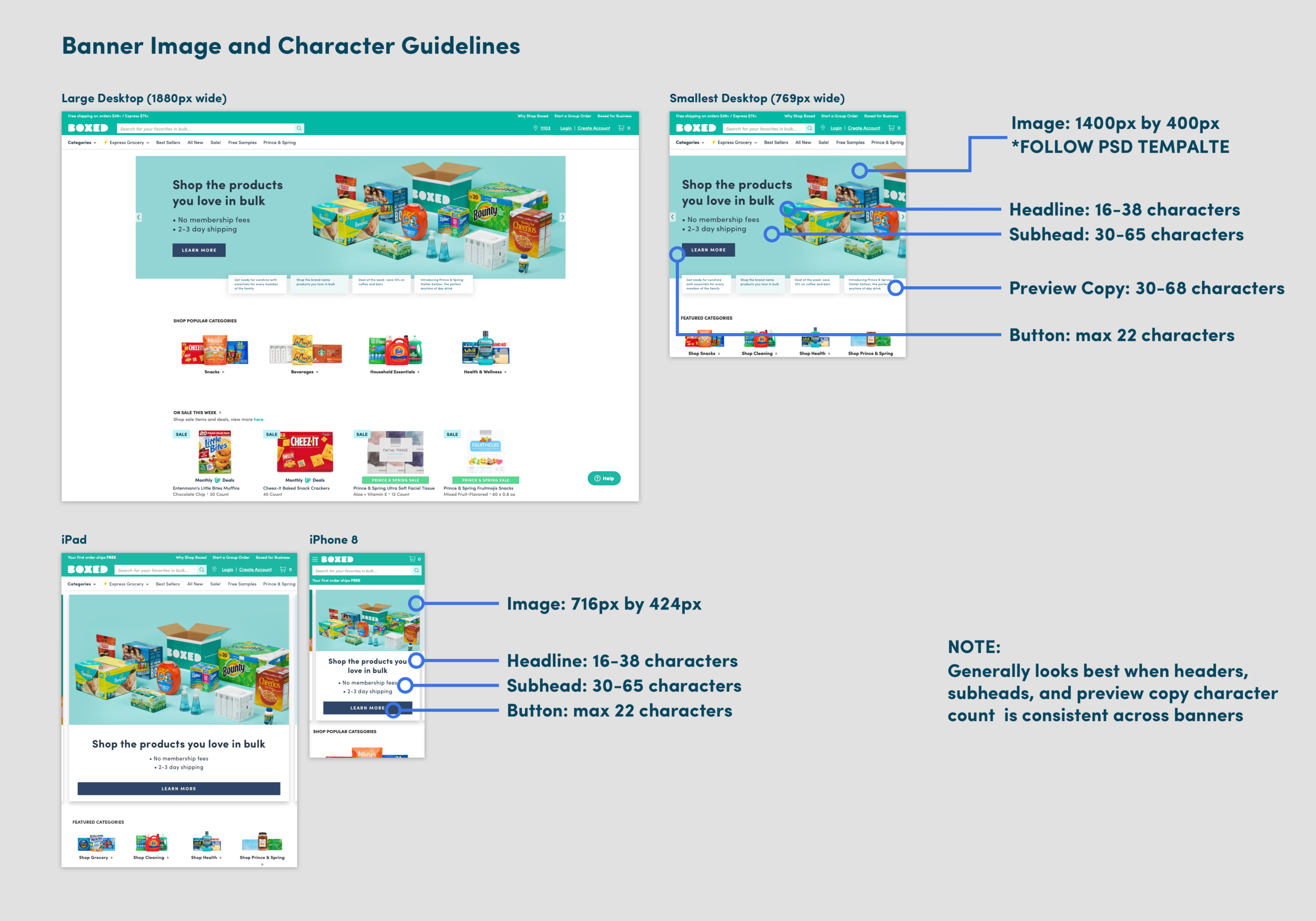
Guidelines for the content marketing team
Going forward
Looking to the future, the plan is to hard code these designs and prove their viability with the help of the data science team. Based on click through and cart averages, we’ll move forward and code these into our internal content management system, so that the content marketing/merchandising teams can continue to manage the homepage with the latest campaign initiatives. Ultimately, we would like to do this for the entire homepage, creating the best experience for both the user and the business.